
Poincaré embeddings
One of the recent trends in machine learning is to move towards of graphical data. Graphs are in fact much richer in information compared to images and sequences and they can therefore capture more complex patterns about the world.
A new branch of deep learning, called geometric deep learning has been emerging. Interaction networks, Graph networks, Capsule networks, and Message passing networks are all types of neural networks designed to either work with graphical data.
I recently started exploring this domain, beginning from one of the most basic tasks related to graphical data, i.e. graphs embedding. A graph embedding is a mapping between graphs and a multi-dimensional manifolds that associate each node in the graph with a point on the manifold.
Geometrical embeddings have applications in several sub-fields of machine learning, such as language representation for NLP systems, social networks modelling and knowledge modelling.
Earlier this year, I followed this excellent seminar from Maximilian Nickel about his work Poincaré Embeddings for Learning Hierarchical Representations. The idea of the paper is to exploit hyperbolic geometries to represent hierarchical relations in a graph.
Trees and forests are the prototypical type of hierarchical graphs, and hyperbolic geometries can be though as the continuous version of trees. A basic property of hyperbolic spaces is that the distance between elements grows exponentially as one moves away from the centre of the space. This property is completely analogous to the distance between nodes in increasingly deeper levels of a tree structure.
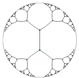 |
| Embedding of a tree in a bidimensional hyberbolic space. |
The paper from Nickel et al. exploits exactly this properties to construct efficient embeddings of a variety of hierarchical graphs. A really cool idea in my opinion!
Experimenting with the Amazon co-purchases dataset
An implementation of the algorithm described in the paper is available in the gensim package, and it is very simple to use. I tried it out on a dataset that was not considered by the paper.
The SNAP project at Stanford maintains a very nice collection of graph data. For this experiment, I wanted to work on a dataset for which ground-truth communities were available. I chose in particular the Amazon co-purchasing network. The dataset contains roughly 300k nodes and about 1M connections.
The code that I used available on my github repository, and it is organized in three notebooks: one for data preparation, one for training, and a third to inspect the trained embedding.
Data
The work required for data preparation is minimal, since the dataset has been already
aggregated and formatted by the SNAP team. The only required action was to convert the
data into the format required by the gensim.poincare classes. In particular the package
expected the graph edges to be encoded as a tab-separated file: each line encodes an edge
of the graph and contains the identifier of the connected nodes.
node1 node2
node1 node4
node2 node3
....
This matched the SNAP convention, except for the fact that the latter adds a header to the file. Ground truth comminities in the SNAP repository are encoded by lines listing the nodes that belong to each community.
node1 node2 node4
node1 node3 node4 node8 node9 node10
node2 node3 node6
....
Training
The training interface is also extremely simple. One can literaly train the model with 3. lines of code
file_path = '../input/amazon_purchases/com-amazon.links.tsv'
relations = PoincareRelations(file_path=file_path, delimiter='\t')

model = PoincareModel(train_data=relations, size=2, burn_in=10) # train a bidimensional embedding with 10 burn-in epochs
model.train(epochs=100, print_every=50000)
The model trainig takes about 10 minutes per iteration with a bi-dimensional embedding and
using 10 negative examples per positive example. The gensim package provides persitency
methods that can be used to save snapshots of the model and continue the training of a
saved model.
The brun-in period corresponds to the number of initial epochs for which the model is trained at a reduced learning rate.
Inspecting the trained model
As for all gensim models, the PoincareModel model contains the vectors associated to
each of the tree elements, as well as methods to compute distances and search for nearest
neighboors.
One can retrieve this information as
vectors = model.kv.vectorsThe array vectors has shape (n_nodes,embed_size). In two dimensions the array can be
directly visualized, for example as a heat-map. The figure below corresponds to the
embedding obtained just after burn-in.
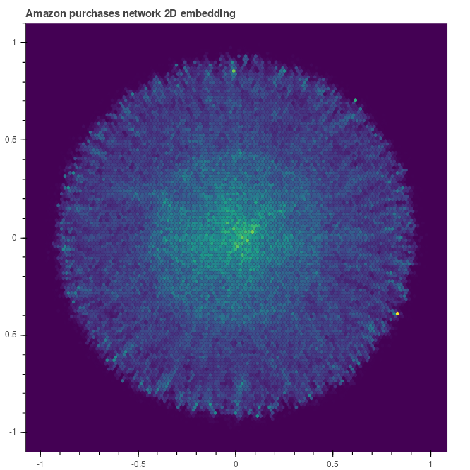 |
| Embedding heat map after burn-in |
How the shape evolves during the training? Let’s inspect the embedding after 30 and 90 epochs. We can note that the graph tends to be pushed towards the unit circle. The elements that are not migrated towars the unit circle are those that live at the top of the hierarchy.
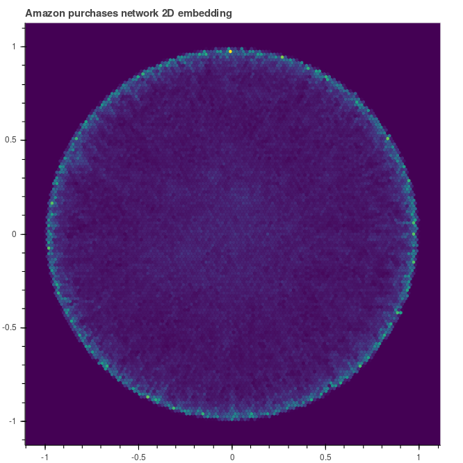 |
 |
| Embedding after 30 epochs | … and after 90 |
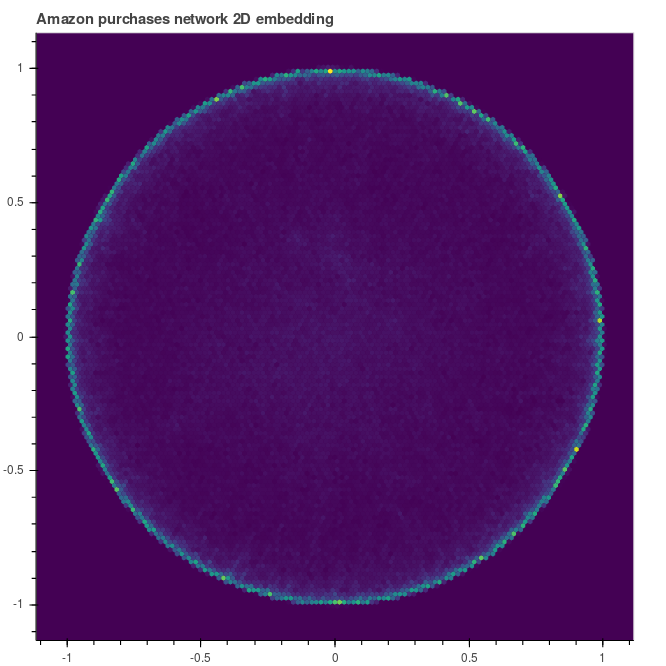
Ok, let’s now compare what the model has learned with the ground-tuth communities (i.e. the bundles of products that are typically sold together on Amazon). To do so, we first of all need to unpack the data.
from gzip import open as gopen

communities_truth = "../input/amazon_purchases/com-amazon.top5000.cmty.txt.gz"

communities = []

with gopen(communities_truth,mode='rb') as gin:
    for iline,line in enumerate(gin.readlines()):
        line = line.decode('ascii')
        if line[0].isnumeric():
            toks = line.split("\t")
            communities.append( list(int(tok) for tok in toks) )
        if iline<=10:print(line.rstrip("\n"))

# we sort the communities by size
communities.sort(key=lambda x: len(x),reverse=True)
We can now retrieve the embedding vectors associated with the communities elements.
communities_xy = [ np.vstack( [ model.kv.get_vector(str(x)) for x in community ] ) for community in communities ]And superimpose them to the embedding heat map.
from bokeh.io import output_file, output_notebook, show
from bokeh.plotting import figure
from bokeh.transform import linear_cmap
from bokeh.util.hex import hexbin
from bokeh.models import HoverTool
from bokeh import colors


p = figure(title="Amazon purchases network 2D embedding after 90 epochs", #tools="wheel_zoom,pan,reset",
     match_aspect=True, background_fill_color='#440154')
p.grid.visible = False

bins = p.hexbin(model.kv.vectors[:,0],model.kv.vectors[:,1], 0.01, hover_color="pink", hover_alpha=0.8)

# trick to get a different color for each community
points_colors = colors.named.__all__

# loop over communities and add them to the plot
for icomm,(col,comm) in enumerate(zip(points_colors,communities_xy)):
    name=str(icomm)
    p.scatter(comm[:,0],comm[:,1],color=col,alpha=0.5,name=name)
	# make hover to display the community id
    hover = HoverTool(names=[name])
    hover.tooltips = [ ('community',name) ]
    p.add_tools(hover)


show(p)
And here is the result.
We can see that indeed nodes belonging to the same communities get embedded to close-by positions! Looking more closely, we also notice that some of the communities are often split into 2 or 3 disconnected sets. It would be interesting to investigate the reason for this. In particular, whether using a higher embedding space dimensionality would allow to reconnect the communities.
Another very visible feature is the fact that the angular size of the communities decreases along the radial direction. This is a direct consequence of the hyperbolic geometry of the manifold. We can try to quantify this defininig metrics to characterize shape and position of the communities. In particular we can look at:
- the baricenter of each community, in particular in the radial direction;
- the geometrical size of the community, that we can estimate looking at diameter, i.e. the largest distance between two elements;
- the aspect of the comunity (ie round vs elongated), that we can quantify computing the principal axes and evaluating the ratio between the largest and the smallest direction.
from sklearn.decomposition import PCA

# we estimate the centroid giving equal weight to each node
centroids = np.vstack( [ community.mean(axis=0) for community in communities_xy ] )

# we define the diameter as the largest (hyperbolic) distance between two elements
diameters = []
for community in communities:
    nel = len(community)
    community = [ str(x) for x in community ]
    distances = []
    for ix in range(nel):
        distances.append( model.kv.distances(community[ix],community[ix:]) )
    diameters.append( np.hstack(distances).max() )

diameters = np.array(diameters)

# we use the ratio between the largest and the smallest independent components variances
# as a measure of the aspect ratio
def aspect_ratio(community):
    pca = PCA(n_components=community[0].shape[0])
    pca.fit(community)

    return(pca.explained_variance_ratio_.min()/pca.explained_variance_ratio_.max())

aspect_ratios = np.array([ aspect_ratio(x) for x in communities_xy ])
And here are the distributions of these metrics. We observe that “standard” communities have diameters of the order of 0.5, but that there is a long tail in the distribution. Such long tails are due to communities that are located closer to the manifold centre, i.e. those that live higher in the hierarchy. A similar picture can be obseerved looking at the aspect ratio.
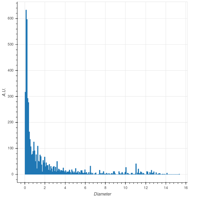 |
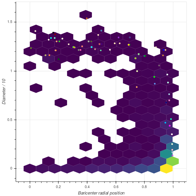 |
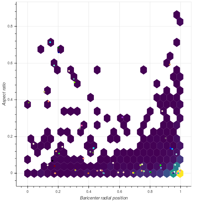 |
Distribution of the community metrics. Circles correspond to the 150 largest communities. |
Wrapping up
That’s it for the moment. The obvious next step will be to increase the dimensionality of the embedding and check how this influences the observed patterns. Is there an algorithm to extract automatically the ground-truth communities from the embedding space? How would it compare with LDA?